


Comic
Signage, in subway spaces and elsewhere, is generally a matter of standards. Most signage designers think in terms of systems, components. The signboards are integrated into a coherent set of signs that have to be recognizable among the many other graphical species that populate their territory. Associated with architecture and design policies that emphasize cleanliness and downplay differences, they carry out the graphical stabilization of the environment. Their omnipresence, as far as in the mountains, produces hybrid places, made of texts, buildings and landscapes. You just have to experience their absence to understand that wayfinding is nowaday a distributed activity within which standardized signs have gradually become essential.
Of course, in terms of public space, it raises many questions, notably about what is performed by the policy of attention that defines such an omnipresence of instructions and ‘mots d’ordre’. Fortunately, because the stabilization of the world rests on a complex division of labor and on demanding setting and maintenance operations, such apparatuses are not flawless. One is never safe from surprises.
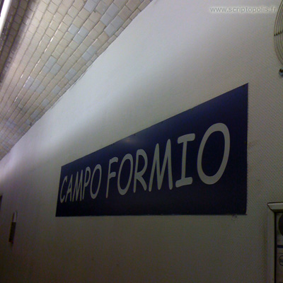
For instance, you would think that the font (the Parisine for the parisian subway) would be the hallowed component of subway signs. And if it would have been replaced by mistake, it should have been with a similar typeface, one borrowed from the New York subway. But here? Come on, the signboard with the name of the station, the touchstone of the wayfinding system, in Comic Sans? It’s a fantasy, isn’t it?